In current day, data is everywhere and is an important part of our lives. We collect, send, analyse, and do lots of other things with data. Data in itself is not visually appealing, but we can make it beautiful. Chart is one such thing that can make data look beautiful & easier to understand / analyse. We can use different chart types to show data depending on the type of data we are showing. In this article, we will see how to add, configure and use different chart types in Angular using CanvasJS angular charts.

Adding CanvasJS angular chart to project
Let's start by adding CanvasJS angular chart component to the project. Download the component from the official download page. Copy the chart component files to the project. Generally, these files are kept under assets directory. Once it's copied, import & register the modules.
import { NgModule } from '@angular/core';
import { BrowserModule } from '@angular/platform-browser';
import { AppComponent } from './app.component';
import * as CanvasJSAngularChart from './assets/canvasjs.angular.component';
var CanvasJSChart = CanvasJSAngularChart.CanvasJSChart;
@NgModule({
declarations: [
AppComponent,
CanvasJSChart
],
imports: [
BrowserModule
],
providers: [],
bootstrap: [AppComponent]
})
export class AppModule { }
As the modules are registered, you can start creating chart. Let's create & display simple column chart in angular.
import { Component } from '@angular/core';
@Component({
selector: 'app-root',
template: '<canvasjs-chart [options]="chartOptions"></canvasjs-chart>'
})
export class AppComponent {
chartOptions = {
title: {
text: "Angular Column Chart"
},
data: [{
type: "column",
dataPoints: [
{ label: "apple", y: 10 },
{ label: "orange", y: 15 },
{ label: "banana", y: 25 },
{ label: "mango", y: 30 },
{ label: "grape", y: 28 }
]
}]
}
}
Here we first imported the CanvasJS chart component & then define the options for the chart. CanvasJS takes data to be plotted along with other chart element customization options as 'chart-options'. In the above example, you can observe labels are passed to each datapoint which are shown below every bar (vertical bar charts are called as column chart). The same can be changed to horizontal bar or line or pie by just changing type property. The data is an array of objects where each dataseries is an object - this means if you pass multiple objects, it creates chart with multiple series.
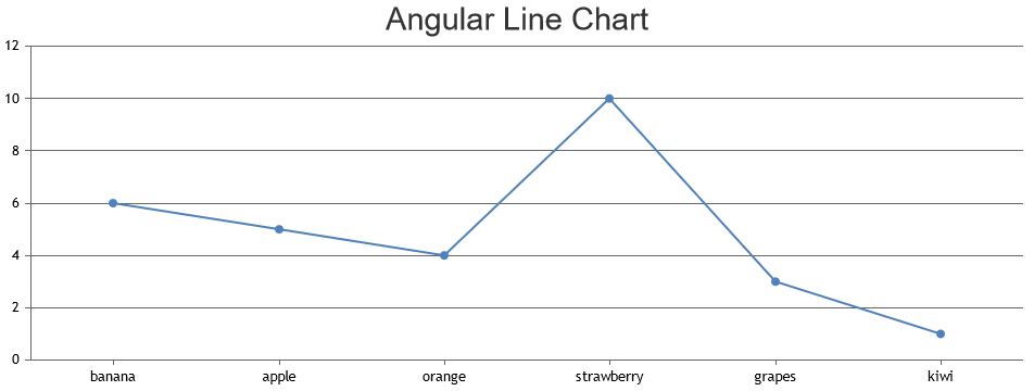
Line Chart
Line chart is a way to represent data in the form of line. Often they are used to show the trend or to compare two different data sets. In the above simple chart that you created, just change type property to 'line' & that should create a line chart instead of column. CanvasJS has different kinds of lines - regular line, spline (similar to line except that the line is smooth), step-line (similar to line but line is in the form of steps/staircase).
chartOptions = {
title: {
text: "Angular Line Chart"
},
data: [{
type: "line",
dataPoints: [
{ label: "apple", y: 10 },
{ label: "orange", y: 15 },
{ label: "banana", y: 25 },
{ label: "mango", y: 30 },
{ label: "grape", y: 28 }
]
}]
}
Just by filling the region between the base and the datapoints value, it create area chart. Component supports different area forms like area, range area, stacked area & gets clubbed with different types of line to create more combinations.
Bar Chart
In bar chart, data is represented in the form of rectangles - vertical bars / horizontal bars. Syntax is same as line but type field takes different value. Bars can be vertical called column chart or horizontal called bar chart. CanvasJS angular component has different kinds of bar charts like bar, range bar, stacked bar, stacked bar 100%, column, range column, stacked column, stacked column 100% & waterfall.
chartOptions = {
title: {
text: "Angular Bar Chart"
},
data: [{
type: "bar",
dataPoints: [
{ label: "apple", y: 10 },
{ label: "orange", y: 15 },
{ label: "banana", y: 25 },
{ label: "mango", y: 30 },
{ label: "grape", y: 28 }
]
}]
}
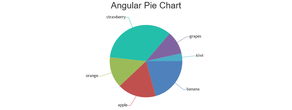
Pie Chart
Pie chart is probably the most commonly used chart where datapoint is represented as slices of the pie. Each slice will show the relational proportion between the data. Pie chart can further be modified to have a hollow space in the centre making it look like a donut & hence this type of chart is called doughnut / donut chart.
chartOptions = {
title: {
text: "Angular Pie Chart"
},
data: [{
type: "pie",
dataPoints: [
{ label: "apple", y: 10 },
{ label: "orange", y: 15 },
{ label: "banana", y: 25 },
{ label: "mango", y: 30 },
{ label: "grape", y: 28 }
]
}]
}
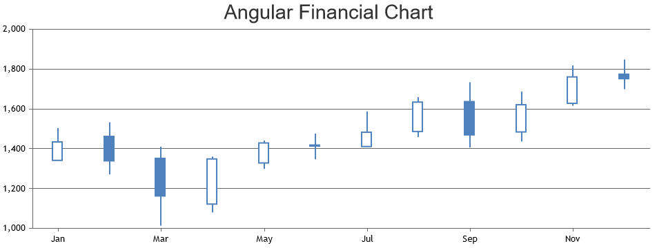
Financial Chart
Financial chart is generally used to show the stock data / trades. These are most commonly used chart type in stock, forex, shares, etc. These charts will generally be dynamic charts - keeps updating latest data automatically by fetching data from some API.
chartOptions = {
title: {
text: "Angular Financial Chart"
},
data: [{
type: "candlestick",
dataPoints: [
{ label: "Jan", y: [1341.55, 1503.21, 1341.55, 1434.22] },
{ label: "Feb", y: [1462.00, 1532.10, 1271.00, 1339.32] },
{ label: "Mar", y: [1351.60, 1410.15, 1013.53, 1162.81] },
{ label: "Apr", y: [1122.00, 1359.98, 1079.81, 1348.66] },
{ label: "May", y: [1328.50, 1441.00, 1299.00, 1428.92] },
{ label: "Jun", y: [1418.39, 1475.94, 1347.01, 1413.60] },
{ label: "Jul", y: [1411.09, 1586.98, 1409.81, 1482.95] },
{ label: "Aug", y: [1486.64, 1659.21, 1458.65, 1634.18] },
{ label: "Sep", y: [1636.63, 1733.18, 1406.55, 1469.59] },
{ label: "Oct", y: [1484.27, 1687.00, 1436.00, 1621.01] },
{ label: "Nov", y: [1628.16, 1818.06, 1616.03, 1760.73] },
{ label: "Dec", y: [1774.36, 1847.19, 1699.00, 1751.88] }
]
}]
}
More Chart Types & Additional Examples
You can check out CanvasJS angular charts gallery page where more working examples are shown with varieties of use-cases & customization. Also complete customization options can be found on CanvasJS's documentation section.
Conclusion
CanvasJS angular chart component makes it easy to showcase varieties of chart types in your application and dashboard. It also supports dynamic charts making it easier to automate to show latest data always.