If you have been working with Angular directives for quite some time now, this article may help you as a refresher; if you are a beginner, this may get you started with Angular directives. We’ll try to break down the concept into its core parts and give easy examples to understand and approach.

Okay, then, let’s try to get started.
What is an Angular Directive?
Angular directives are HTML attributes that extend the behavior or the appearance of a standard HTML element. In other words, we can say that directives are simply instructions to the DOM. That’s why when we apply a directive to an HTML element or even an Angular component, we can add custom behavior or alter its appearance.
The excellent thing is that Angular provides a set of built-in directives that we can use in our components to cover most use cases.
These Angular built-in directives are part of the CommondModule.
So, we need to import CommonModule when we want to use them.
See an example of importing the built-in directives below.
import {NgForOf, NgIf, NgSwitch, NgSwitchCase} from '@angular/common';
For more information, you can check this official documentation https://v17.angular.io/api/common/CommonModule.
Types of Directives
We need to know the types of directives when dealing with Angular.
Let’s see them one by one.
Component Directives
These are directives with an associated template.
That’s why this is the commonly used directive in Angular application development.
Let’s see an example below.
import { Component } from '@angular/core';
@Component({
selector: 'app-component-directives-sample',
standalone: true,
imports: [],
templateUrl: './component-directives-sample.component.html',
styleUrl: './component-directives-sample.component.css'
})
export class ComponentDirectivesSampleComponent {
}
From our example above, if you are already familiar with components and how to generate components.
That’s fundamentally it.
Just remember that all components are directives, but not all directives are components.
Components extend the concept of directives by providing a view (template) to render.
Structural Directives
Structural directives are used to manage the elements from the DOM, such as adding or removing elements. If a developer is building dynamic and interactive web applications with Angular, managing the display of elements based on certain conditions or iterating over a collection is essential.
Angular provides three powerful structural directives to handle these scenarios: *ngIf, *ngSwitch, and *ngFor.
Let’s dive into how these directives work and how to use them.
The *ngIf
This directive allows you to conditionally display or remove an element from the DOM based on a boolean expression.
If the condition is evaluated as true, the element is rendered; otherwise, it is removed from the DOM.
See the example below.
app.component.ts
import { Component } from '@angular/core';
import {NgIf} from '@angular/common';
@Component({
selector: 'app-root',
standalone: true,
imports: [NgIf],
templateUrl: './app.component.html',
styleUrl: './app.component.css'
})
export class AppComponent {
title = 'sampleDirectives';
showProduct: boolean = true;
products:Array<any>= [
{ id: 1,
name: "Intel Core i9-11900K",
type: "CPU"
},
{
id: 2,
name: "AMD Ryzen 9 5950X",
type: "CPU"
}
];
}
app.component.html
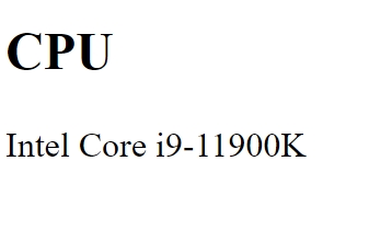
<div *ngIf="showProduct">
<h2 [innerText]="products[0].type"></h2>
<p [innerText]="products[0].name"></p>
</div>
From our sample code, we have the showProduct set to true and a product array to hold dummy product data.
With this view, we have decided to get the first index item of the products array.
As a result, the HTML view will show the product type and the product name.
See the output below.
The *ngSwitch
As you can see, the *ngIf works excellent for a single condition, while *ngSwitch is more efficient when you need to toggle between multiple options.
It looks almost like a switch-case statement in programming, where you can choose between different elements to render based on an expression.
See the example below.
app.component.ts
import { Component } from '@angular/core';
import {NgForOf, NgIf, NgSwitch, NgSwitchCase} from '@angular/common';
@Component({
selector: 'app-root',
standalone: true,
imports: [ NgIf, NgSwitch, NgSwitchCase, NgForOf],
templateUrl: './app.component.html',
styleUrl: './app.component.css'
})
export class AppComponent {
title = 'sampleDirectives';
showProduct: boolean = true;
products:Array<Product>= [
{ id: 1,
name: "Intel Core i9-11900K",
type: "CPU"
},
{
id: 2,
name: "AMD Ryzen 9 5950X",
type: "CPU"
},
{
id: 3,
name: "EVGA SuperNOVA 850 G5",
type: "Power Supply"
},
{
id: 4,
name: "G.Skill Ripjaws V Series 32GB",
type: "Memory"
}
];
firstProduct: Product;
secondProduct: Product;
thirdProduct: Product;
constructor() {
this.firstProduct = this.products[0];
this.secondProduct = this.products[1];
this.thirdProduct = this.products[2];
}
}
export class Product {
id: number = 0;
name: string = "";
type: string = "";
}
app.component.html
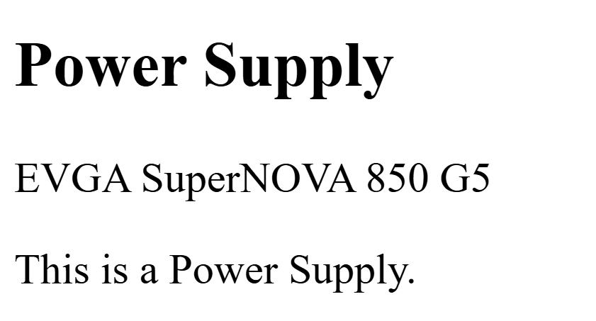
<div [ngSwitch]="thirdProduct.type">
<h2 [innerText]="thirdProduct.type"></h2>
<p [innerText]="thirdProduct.name"></p>
<p *ngSwitchCase="'CPU'">
This product is a CPU.
</p>
<p *ngSwitchCase="'Memory'">
This is a RAM (Random Access Memory).
</p>
<p *ngSwitchCase="'Power Supply'">
This is a Power Supply.
</p>
</div>
As a result, the HTML view will show the product type and the product name.
See the output below.
The *ngFor
I know what you are thinking if you have been dealing with programming. *ngFor is used to repeat an element for each item in a collection. Looks like a loop, right?
From our previous example, we won’t change “app.component.ts.”
We’ll add the *ngFor inside the app.component.html.
Let’s see an example below.
app.component.html
<div>
<ul>
<li *ngFor="let product of products">
<h2 [innerText]="product.name"></h2>
<p [ngSwitch]="product.type">
<span *ngSwitchCase="'CPU'">
This product is a CPU.
</span>
<span *ngSwitchCase="'Memory'">
This is a RAM (Random Access Memory).
</span>
<span *ngSwitchCase="'Power Supply'">
This is a Power Supply.
</span>
</p>
</li>
</ul>
</div>
As a result, the HTML view will show an unordered list of products.
See the output below.

Attribute Directives
Attribute directives modify the appearance of or define a custom behavior for a DOM element.
Angular has a rich set of built-in directives that allow dynamic styling and classes to be applied.
Among these directives, ngClass and ngStyle are essential tools for any Angular developer.
Let’s try to explore them one by one.
The ngClass
We can use this directive ngClass to add or remove CSS classes dynamically.
Moreover, developers can use this directive to apply one or more CSS classes to an element conditionally.
You can pass a string, array, or object to ngClass to control which classes should be added or removed.
You can use either the expression or method with the ngClass directive.
Using Expression
A developer can’t write if condition within the ngClass directive.
However, we can use the ternary operator as this is an expression.
//Syntax
[ngClass]="condition ? 'when true apply class' : 'when false apply class'"
//Syntax (multiple classes)
[ngClass]="condition ? 'when true apply class1 class2' : 'when false apply class1 class2'"
Let’s have an example below.
attribute-directive-samp.component.css
.dot {
height: 100px;
width: 100px;
border-radius: 50%;
display: inline-block;
background-color: #c1bbbb;
}
.dot-border-red {
border-color: red;
border-style: dotted;
border-width: 3px;
}
.dot-border-yellow {
border-color: yellow;
border-style: dotted;
border-width: 3px;
}
.yellow {
background-color: yellow;
}
.red {
background
attribute-directive-samp.component.ts
import { Component } from '@angular/core';
import {NgClass} from '@angular/common';
@Component({
selector: 'app-attribute-directive-samp',
standalone: true,
imports: [
NgClass
],
templateUrl: './attribute-directive-samp.component.html',
styleUrl: './attribute-directive-samp.component.css'
})
export class AttributeDirectiveSampComponent {
isYellow = false;
isRed: boolean = false;
colorChanged(value:string): void {
if(value === 'R'){
this.isRed = true;
this.isYellow = false;
}
else if(value === 'Y'){
this.isYellow = true;
this.isRed = false;
}
}
}
attribute-directive-samp.component.html
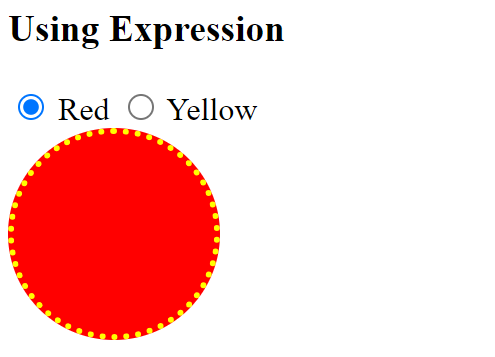
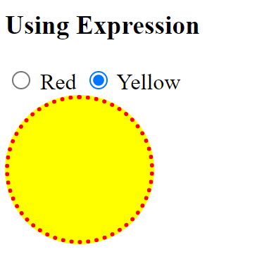
<h3>Using Expression</h3>
<input type="radio" name="firstDot" value="R" (change)="colorChanged('R')" /> Red
<input type="radio" name="firstDot" value="Y" (change)="colorChanged('Y')" /> Yellow
<br/>
<div class="dot" [ngClass]="isRed ? 'dot red dot-border-yellow': 'dot yellow dot-border-red'">
</div>
From our example, we have seen that we can change the circle’s background color and border when choosing between red and yellow.
We have achieved this by using an expression inside the ngClass.
Output
Using Function
Developers can apply CSS classes through various methods in complex conditions.
For example, you can use this way to set a CSS class based on user input.
Let’s see an example below.
attribute-directive-samp-using-function.component.css
.dot {
height: 100px;
width: 100px;
border-radius: 50%;
display: inline-block;
background-color: #c1bbbb;
}
.dot-border-red {
border-color: red;
border-style: dotted;
border-width: 3px;
}
.dot-border-yellow {
border-color: yellow;
border-style: dotted;
border-width: 3px;
}
.yellow {
background-color: yellow;
}
.red {
background-color: red;
}
attribute-directive-samp-using-function.component.ts
import { Component } from '@angular/core';
import {FormsModule} from '@angular/forms';
import {NgClass} from '@angular/common';
@Component({
selector: 'app-attribute-directive-samp-using-function',
standalone: true,
imports: [
FormsModule,
NgClass
],
templateUrl: './attribute-directive-samp-using-function.component.html',
styleUrl: './attribute-directive-samp-using-function.component.css'
})
export class AttributeDirectiveSampUsingFunctionComponent {
selectedColor: string = "";
getClassColorValue(): string {
let classToReturn = '';
if(this.selectedColor === 'Red'){
classToReturn = 'dot red dot-border-yellow';
}
else if(this.selectedColor === 'Yellow'){
classToReturn = 'dot yellow dot-border-red';
}
return classToReturn;
}
}
attribute-directive-samp-using-function.component.html
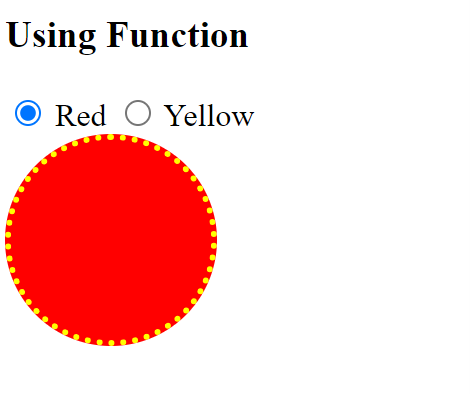
<h3>Using Function</h3>
<input type="radio" name="secondDot" value="Red" [(ngModel)]="selectedColor" /> Red
<input type="radio" name="secondDot" value="Yellow" [(ngModel)]="selectedColor" /> Yellow
<br/>
<div class="dot" [ngClass]="getClassColorValue()"></div>
From our example, we have seen that we can change the circle’s background color and border when choosing between red and yellow.
However, instead of an expression, we used a method or function where the class was set inside the ngClass.
Note. For both examples, we use the same styles for attribute-directive-samp.component.css and attribute-directive-samp-using-function.component.css.
Again, we have achieved our goal for both examples, but by using different approaches, it's up to the developer to choose either expression or method/function.
Output
The ngStyle
Developers, when using the ngStyle directive, allow them to set the style property of the DOM element.
People suggest directly putting styles inside the style attribute isn’t that good.
But in our case, and for educational purposes, we need to understand that this directive is available for us to use in some cases.
Let’s see an example.
attribute-directives-ngstyle.component.ts
import {Component} from '@angular/core';
import {NgStyle} from '@angular/common';
import {FormsModule} from '@angular/forms';
@Component({
selector: 'app-attribute-directives-ngstyle',
standalone: true,
imports: [
NgStyle,
FormsModule
],
templateUrl: './attribute-directives-ngstyle.component.html',
styleUrl: './attribute-directives-ngstyle.component.css'
})
export class AttributeDirectivesNgstyleComponent {
isBold : boolean = false;
isItalic:boolean = false;
isUpperCase: boolean = false;
setElementStyle() {
return {
'font-weight': this.isBold ? 'bold' : 'normal',
'font-style': this.isItalic ? 'italic' : 'normal',
'text-transform': this.isUpperCase ? 'uppercase' : 'none'
};
}
}
attribute-directives-ngstyle.component.html
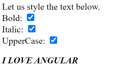
<p>
Let us style the text below.
<br/>
Bold: <input type="checkbox" [(ngModel)]="isBold" /> <br/>
Italic: <input type="checkbox" [(ngModel)]="isItalic" /> <br/>
UpperCase: <input type="checkbox" [(ngModel)]="isUpperCase" /> <br/>
</p>
<div [ngStyle]="setElementStyle()">I love Angular</div>
From our example, we have built an object that checks whether the checkboxes are checked, which makes the isItalic, isUpperCase, and isBold true or false with specific values at runtime.
Then, it will be returned as an object assigned to the ngStyle directive.
See the output below.
Summary
In this post, we have discussed the three types of directives: component, structural, and attribute. However, component directives seem straightforward to most of us developers. We have seen a lot of examples of structural and attribute directives, and the examples we have are the built-in directives for these types of directives built into the Angular library for most use cases. I hope you have enjoyed this article as much as I have enjoyed writing it.
Stay tuned for more information, and don't forget to download the attached project source code.
If you run the project source code, don’t forget to command “npm install.”
Until next time, happy programming, and good luck with your career!