Full Trust European Hosting

BLOG about Full Trust Hosting and Its Technology - Dedicated to European Windows Hosting Customer

AngularJS Hosting Europe - HostForLIFE.eu :: Data Binding in Angular

clock March 26, 2024 07:34 by author Peter

Data binding serves as a link between the template (representing the view) and the component (which contains the application's logic and data).

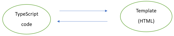
In Angular data binding, various types are used to define the direction of data flow between the component and the template (view).

Type of Data Binding

  • One-way Data Binding
  • Two-way Data Binding

One-way Data Binding

Interpolation

Interpolation is a simple and straightforward method for embedding dynamic values into HTML templates. It allows you to show component properties in the view.

Example
//app.component.ts

import { Component } from '@angular/core';
import { CommonModule } from '@angular/common';

@Component({
  selector: 'app-root',
  standalone: true,
  imports: [CommonModule],
  templateUrl: './app.component.html',
  styleUrl: './app.component.css'
})
export class AppComponent {
  title = 'TodoList';
}

<!-- app.component.html -->
<h1>{{title}}</h1>

Property Binding

Property binding allows you to bind a property of a DOM element to a component property. This way, changes in the component automatically reflect in the view.

Example
//app.component.ts

import { Component } from '@angular/core';
import { CommonModule } from '@angular/common';

@Component({
selector: 'app-root',
standalone: true,
imports: [CommonModule],
templateUrl: './app.component.html',
styleUrl: './app.component.css'
})
export class AppComponent {
isDisabled= true;
}

<!-- app.component.html -->
<button [disabled]="isDisabled">Click me</button>

Event Binding
Event binding enables you to respond to user interactions or other events by connecting a component method with a specific event in an HTML template. This two-way link allows for dynamic and interactive user experiences by triggering component functions in response to user actions like clicks, hovers, touches, and other events.

Example
//app.component.ts

import { Component } from '@angular/core';
import { CommonModule } from '@angular/common';
import { RouterOutlet } from '@angular/router';

@Component({
selector: 'app-root',
standalone: true,
imports: [CommonModule, RouterOutlet],
templateUrl: './app.component.html',
styleUrl: './app.component.css'
})
export class AppComponent {
onClick() {
console.log(Hi Welcome!');
}
}


<!-- app.component.html -->
<button (click)="onClick()"> Click me 😊</button>

Two-way Data Binding

Two-way binding combines property and event binding to provide a bidirectional link between a component property and a template input element. This synchronization allows for automated updates in both directions, guaranteeing that changes to the component's properties are reflected in the template and vice versa, eliminating the need for explicit event handling or manual updates. To utilize [(ngModel)], you must import the FormsModule into your module, as it contains the directives required for two-way binding.

Example
//app.component.ts

import { Component } from '@angular/core';
import { CommonModule } from '@angular/common';
import { FormsModule } from '@angular/forms';

@Component({
  selector: 'app-root',
  standalone: true,
  imports: [CommonModule,FormsModule],
  templateUrl: './app.component.html',
  styleUrl: './app.component.css'
})
export class AppComponent {
  text: string = '';
}

<1 -- app.component.html -->

<input [(ngModel)]="text" placeholder="Please enter text here">
<p>the text which you have type: {{ text }}</p>


Data binding is essential for connecting the application's logic with the user interface, offering one-way bindings for efficient data transfer and two-way bindings, exemplified by [(ngModel)], for seamless bidirectional synchronization, streamlining the development of dynamic and interactive web applications.


AngularJS Hosting Europe - HostForLIFE.eu :: Animated Credit Card Design Using Angular

clock March 18, 2024 09:17 by author Peter

To create an aminated credit card form in Angular, alter the app.module.ts file as follows:

Final Screen: Animated Credit Card

Final Screen animated credit card for the sample shown below.

In ngModule

  • declarations: Specifies the components, directives, and pipes that belong to this module. In this case, AppComponent is declared here.
  • imports: Lists other modules whose exported classes are needed by component templates declared in this NgModule. Here, various Angular modules like CommonModule, AppRoutingModule, BrowserAnimationsModule, FormsModule, and ReactiveFormsModule are imported.(CommonModule for Using *ngfor and *ngIf directive, FormsModule, ReactiveFormsModule - to use the form, BrowserAnimationsModule- in the following sample, we used animation module).
  • schemas: This is an array of schema types that should be ignored or not checked for this module. CUSTOM_ELEMENTS_SCHEMA tells Angular to ignore or accept any elements and attributes that are not standard HTML but are custom elements. NO_ERRORS_SCHEMA tells Angular to ignore unknown elements and attributes altogether.
  • bootstrap: Specifies the main component that should be bootstrapped when this NgModule is bootstrapped. In this case, it's AppComponent.

@NgModule({
  declarations: [AppComponent], // Components, directives, and pipes that belong to this NgModule.
  imports: [
    CommonModule, // Provides commonly used directives, pipes, and services.
    AppRoutingModule, // The routing module for the application.
    BrowserAnimationsModule, // Module for providing animations support in Angular.
    FormsModule, // Module for two-way data binding using ngModel directive.
    ReactiveFormsModule // Module for reactive forms support.
  ],
  schemas: [CUSTOM_ELEMENTS_SCHEMA, NO_ERRORS_SCHEMA], // Defines the schema to be used for components.
  bootstrap: [AppComponent] // The main component to be bootstrapped when this NgModule is bootstrapped.
})


In (app.component.ts)

  • selector: Defines the HTML tag that will represent this component in other HTML files.
  • encapsulation: Specifies the encapsulation strategy for the component's styles. ViewEncapsulation.None means that the styles defined in the component will affect the entire application without any encapsulation.
  • templateUrl: Points to the external HTML file containing the template for this component.
  • styleUrls: An array of URLs pointing to external style files (like SCSS or CSS) for this component.
  • animations: An array of animation definitions for this component. In this case, it defines an animation trigger named 'flipState' which flips the component around the Y-axis when the state changes from 'active' to 'inactive' and vice versa.

@Component({
  selector: 'app-root', // The CSS selector that identifies this component in a template.
  encapsulation: ViewEncapsulation.None, // Defines how the styles of the component should be encapsulated. 'None' means no encapsulation.
  templateUrl: './app.component.html', // The URL of the template file for this component.
  styleUrls: ['./app.component.scss'], // An array of URLs of the style files for this component.
  animations: [ // An array of animation definitions for this component.
    trigger('flipState', [ // Defines an animation trigger named 'flipState'.
      state('active', style({ // Defines a state named 'active' with a specific style.
        transform: 'rotateY(179deg)' // CSS transformation to rotate the element.
      })),
      state('inactive', style({ // Defines a state named 'inactive' with a specific style.
        transform: 'rotateY(0)' // CSS transformation to rotate the element back to its original position.
      })),
      transition('active => inactive', animate('500ms ease-out')), // Defines a transition from 'active' to 'inactive' state with specific animation.
      transition('inactive => active', animate('500ms ease-in')) // Defines a transition from 'inactive' to 'active' state with specific animation.
    ])
  ]
})

In the below session, continue the app component.

Added the CardDetails object to get the card info, and while clearing, the object was reset to the initial state.
toggleFlip(): If we are entering CVV, only the credit card needs to be animated and show the back card, so here we have set the flip animation trigger we have defined as 'active'
toggleFront(): If we are unfocused CVV input, we need to animate and show the front card, so here we have set the flip animation trigger we have defined as 'inactive'

export class AppComponent {
  isShowBackCard: boolean = false;
  flip: string = 'inactive';
cardDetails:any=
{
  Name:null,
  CardNumber:null,
  CVV:null,
  ExpiryMonth:2,
  ExpiryYear:24
};
  toggleFlip() {
    this.flip ='active';
  }
  toggleFront()
  {
    this.flip =  'inactive';
  }
  constructor() {}
  Clear()
  {
    this.cardDetails=
    {
      Name:null,
      CardNumber:null,
      CVV:null,
      ExpiryMonth:2,
      ExpiryYear:24
    };
  }
  title = 'card-test';
}


In (app.component.html)
Here, we have two sections: one credit card front and back design and form with validation using template-driven forms.

Credit card design
    [@flipState]="flip" we have using the flipstate animation trigger.
    if filpstate is inactive, we will display the front card, and active means we will show the back card.
    the flipstate will set based on focus on cvv input.

<main class="main">
  <div class="content">
    <div>
      <div class="tp-box" [@flipState]="flip">
        <div class="front-card" *ngIf="flip === 'inactive'">
          <p class="card-number">CARD NUMBER</p>
          <p class="card-number">{{!cardDetails.CardNumber? "XXXX-XXXX-XXXX-XXXX" :cardDetails.CardNumber}}</p>
          <div class="info-container row">
            <div class="col-md-9">
              <p class="cardholder-name ">CARD HOLDER NAME</p>
              <p class="cardholder-name">{{!cardDetails.Name? "YYYYYYY YYYYYYYY" :cardDetails.Name}}</p>
            </div>
            <div class="col-md-3">
              <p class="exp-date ">EXPIRY (MM/YY)</p>
              <p class="exp-date ">{{cardDetails.ExpiryMonth}}/{{cardDetails.ExpiryYear}}</p>
            </div>
          </div>
        </div>
        <div class="back-card" *ngIf="flip === 'active'">
          <p class="cvc">{{cardDetails.CVV}}</p>
        </div>
      </div>
      <div class="panel panel-default card-glass">
        <div class="panel-heading no-bg-color">
          <h1 class="or-color">Enter Card Details</h1>
        </div>
        <div class="panel-body">
          <div class="right-payment-sec">
            <form #cardForm="ngForm" autocomplete="off" name="cardForm" (ngSubmit)="cardForm.valid">
              <div class="row">
                <div class="col-lg-12 col-xs-12">
                  <div class="form-group">
                    <label class="no-bg-color" for="name">Name On Card</label>
                    <input type="text" class="form-control no-bg-color"
                      [ngClass]="{ 'has-error': cardForm.submitted && name.invalid }" #name="ngModel" id="name"
                      [(ngModel)]="cardDetails.Name" required autofocus name="name" placeholder="Name On Card">
                    <div *ngIf="cardForm.submitted && name.invalid" class="">
                      <label class="control-label error-message" *ngIf="name.errors?.['required']"><i
                          class="fa fa-times"></i> Required</label>
                    </div>
                  </div>
                </div>
                <div class="col-lg-12 col-xs-12">
                  <div class="form-group">
                    <label class="no-bg-color" for="cardnumber">Card Number</label>
                    <input type="number" class="form-control no-bg-color" #cardnumber="ngModel" id="cardnumber"
                      [(ngModel)]="cardDetails.CardNumber" name="cardnumber"
                      onKeyPress="if(this.value.length==16) return false;" required
                      [ngClass]="{ 'has-error': cardForm.submitted && cardnumber.invalid }"
                      placeholder="XXXX-XXXX-XXXX-XXXX">
                    <div *ngIf="cardForm.submitted && cardnumber.invalid" class="">
                      <label class="control-label error-message" *ngIf="cardnumber.errors?.['required']"><i
                          class="fa fa-times"></i> Required</label>
                    </div>
                  </div>
                </div>
                <div class="col-lg-6 col-md-6 xol-sm-6 col-xs-12 card-infos-container">
                  <label class="no-bg-color" for="expiry">Expiration (MM/YY)</label>

                  <div class="form-group date-container" id="date">
                    <div class="date">

                      <input type="number" class="form-control no-bg-color " placeholder="MM" #expiryMonth="ngModel"
                        [ngClass]="{ 'has-error': cardForm.submitted && expiryMonth.invalid }" id="expiryMonth"
                        [(ngModel)]="cardDetails.ExpiryMonth" name="expiryMonth" [min]="1" [max]="12" required>
                      <input type="number" class="form-control no-bg-color" placeholder="YY" #expiryYear="ngModel"
                        [ngClass]="{ 'has-error': cardForm.submitted && expiryYear.invalid }" id="expiryYear"
                        [(ngModel)]="cardDetails.ExpiryYear" name="expiryYear" [min]="01" [max]="99" required>

                    </div>
                    <div *ngIf="cardForm.submitted && (expiryMonth.invalid||expiryYear.invalid)" class="">
                      <label class="control-label error-message" *ngIf="expiryMonth.errors?.['required']"><i
                          class="fa fa-times"></i> Required</label>
                      <label class="control-label error-message" *ngIf="expiryMonth.errors?.['min']"><i
                          class="fa fa-times"></i> month 01-12 only</label>
                      <label class="control-label error-message" *ngIf="expiryMonth.errors?.['max']"><i
                          class="fa fa-times"></i> month 01-12 only</label>
                      <label class="control-label error-message" *ngIf="expiryYear.errors?.['required']"><i
                          class="fa fa-times"></i> Required</label>
                      <label class="control-label error-message" *ngIf="expiryYear.errors?.['min']"><i
                          class="fa fa-times"></i> Year 01-99 only</label>
                      <label class="control-label error-message" *ngIf="expiryYear.errors?.['max']"><i
                          class="fa fa-times"></i> Year 01-99 only</label>
                    </div>
                  </div>
                </div>
                <div class="col-lg-3 col-md-3 xol-sm-6 col-xs-12">
                  <div class="form-group">
                    <label class="no-bg-color" for="cvv">CCV</label>
                    <input type="number" class="form-control no-bg-color" #cvv="ngModel"
                      [ngClass]="{ 'has-error': cardForm.submitted && cvv.invalid }" id="cvv"
                      [(ngModel)]="cardDetails.CVV" name="cvv" required
                      (focus)="$event.stopPropagation();$event.preventDefault();toggleFlip()"
                      (blur)="$event.stopPropagation();$event.preventDefault();toggleFront()"
                      onKeyPress="if(this.value.length==3) return false;" placeholder="XXX">
                    <div *ngIf="cardForm.submitted && cvv.invalid" class="">
                      <label class="control-label error-message" *ngIf="cvv.errors?.['required']"><i
                          class="fa fa-times"></i> Required</label>
                    </div>
                  </div>
                </div>

                <div class="modal-footer">
                  <div class="form-group">
                    <button type="submit" class="btn btn-primary button-form" style="margin-right: 10px ;">Save</button>
                    <button type="button" class="btn btn-primary button-form" (click)="Clear()">Clear</button>
                  </div>
                </div>
              </div>
            </form>
          </div>
        </div>
      </div>
    </div>
  </div>
</main>


app.component.scss

.background {
    width: 100%;
    height: 47.5vw;
    background-image: url(../assets/Credit-card-bro.svg), linear-gradient(to right, #00e7ff, #634d38);
    background-repeat: no-repeat;
    background-size: cover;
}

.card-glass {
    backdrop-filter: blur(3px) saturate(113%);
    -webkit-backdrop-filter: blur(3px) saturate(113%);
    background-color: rgba(255, 255, 255, 0);
    border-radius: 12px;
    border: 2px solid rgb(123 107 107);
}

input {
    border: 1px solid rgb(123 107 107);
}

.no-bg-color {
    background-color: transparent !important;
    font-size: medium;
    color: #df7017;
}

.or-color {
    color: #df7017;
}

.front-card {
    -webkit-transform: rotateY(0deg);
    -ms-transform: rotateY(0deg);
    transform: rotateY(0deg);
    background-image: url(../assets/1234.png);
    margin-left: 19%;
    // display: flex;
    // flex-direction: column;
    justify-content: space-around;
    border-radius: 8px;

    //  *{
    // margin-left: 1.5rem;
    // margin-top: 10.5rem;
    //  }
    .exp-date {
        font-size: 2rem;
    }

    .card-number {
        font-size: 2rem;
        margin-left: 1.5rem;
    }

    .cardholder-name {
        margin: 0;
        font-size: 2rem;
    }

    .info-container {

        width: 85%;
        // display: flex;
        // justify-content: space-between;
        margin-left: 1.5rem;
        margin-top: 6.5rem;
        font-family: sans-serif;
        font-weight: lighter;
        text-transform: uppercase;
    }

    img {
        width: 20%;
        height: 20%;
    }
}

.back-card {
    background-image: url(../assets/bg-card-back.png);
    display: flex;
    align-items: center;
    justify-content: end;
    -webkit-transform: rotateY(-180deg);
    -ms-transform: rotateY(-180deg);
    transform: rotateY(-180deg);
    margin-left: 19%;
    backface-visibility: hidden;

    p {
        margin-right: 6rem;
        font-size: medium;
    }
}

.back-card,
.front-card {
    background-repeat: no-repeat;
    background-size: cover;
    position: absolute;
    top: 0;
    left: 0;
    width: 447px;
    height: 245px;

    color: whitesmoke;
}

@media screen and (max-width: 768px) {

    .front-card,
    .back-card {
        position: absolute;
        width: 248px;
        height: 136px;
        margin-left: 0;

    }

    .front-card {
        bottom: -2rem;
        left: 1rem;
        z-index: 10;

        .card-number {
            font-size: 1rem;
        }

        .cardholder-name {
            font-size: 0.8rem;
        }

        .exp-date {
            font-size: 0.8rem;
        }
    }

    .back-card {
        top: 2rem;
        right: 1rem;

        p {
            margin-right: 2rem;
            font-size: 0.8rem;
        }
    }
}

.credit-form {
    min-width: 150px;
    max-width: 400px;
    width: 100%;
}

.full-width {
    width: 100%;
}

form {
    width: 100%;
    display: flex;
    flex-direction: column;

    input::-webkit-outer-spin-button,
    input::-webkit-inner-spin-button {
        -webkit-appearance: none;
        margin: 0;
    }

    .card-infos-container {

        .date-container {
            width: 47%;

            .date {

                display: flex;
                gap: 1rem;
                width: 100%;

                mat-form-field {
                    width: 40%;
                }
            }
        }
    }

    button {
        height: fit-content;
    }
}

.button-form {
    margin-right: 10px;
    height: fit-content;
    font-size: larger;
}


.tp-box__side {
    width: 100%;
    height: 100%;
    position: absolute;

    -webkit-backface-visibility: hidden;
    backface-visibility: hidden;

    color: #fff;
    text-align: center;
    line-height: 100px;
    font-size: 24px;
    font-weight: 700;
    cursor: pointer;
    -webkit-user-select: none;
    -moz-user-select: none;
    -ms-user-select: none;
    user-select: none;
}

.tp-box {
    position: relative;
    height: 215px;
    z-index: 15;
    margin: 3rem auto;
    -webkit-transform-style: preserve-3d;
    transform-style: preserve-3d;
    -webkit-transform: transform 1s;
    -ms-transform: transform 1s;
    transform: transform 1s;
}


AngularJS Hosting Europe - HostForLIFE.eu :: Reactive Forms In Angular with Practical Example

clock March 5, 2024 08:47 by author Peter

Angular is a popular framework for developing dynamic web apps, and one of its most notable features is its robust forms module. Angular provides two types of forms: template-driven and reactive forms. In this post, we'll look into reactive forms in Angular, including their benefits, how to design them, and how to use them efficiently.


What are the reactive forms? Reactive forms, also known as model-driven forms, are a more adaptable and scalable way to create forms in Angular. Unlike template-driven forms, which essentially specify the form's behavior in the template, reactive forms are defined programmatically by creating form control objects with TypeScript classes.

Key Benefits of Reactive Forms
More control and flexibility: Reactive forms give developers more control over form validation, error handling, and dynamic form controls.

  • Immutable data model: Reactive forms use an immutable data model, making it easier to track changes and manage form states.
  • Better support for complex forms: Reactive forms are well-suited for building complex forms with dynamic form controls and complex validation requirements.
  • Easier unit testing: Since form controls are created programmatically as TypeScript objects, they are easier to unit test compared to template-driven forms.

Creating Reactive Forms
To create a reactive form in Angular, follow these steps:
Import the necessary Angular modules

import { Component, OnInit } from '@angular/core';
import { FormBuilder, FormGroup, Validators } from '@angular/forms';

JavaScript
Define the form in the component class

import { Component } from '@angular/core';
import { FormGroup, FormBuilder, Validators } from '@angular/forms';

@Component({
  selector: 'app-contact-form',
  templateUrl: './contact-form.component.html',
  styleUrl: './contact-form.component.css'
})
export class ContactFormComponent {

  contactForm!: FormGroup;

  constructor(private fb: FormBuilder) {
    this.formBuilder();
  }

  private formBuilder() {
    debugger;
    this.contactForm = this.fb.group({
      name: ['',Validators.required],
      email: ['',[Validators.email,Validators.required]],
      password: ['', [
        Validators.pattern(/^(?=.*[a-z])(?=.*[A-Z])(?=.*\d)(?=.*[!@#$%^&*])[a-zA-Z\d!@#$%^&*]{6,}$/), // Updated pattern
        Validators.minLength(6),
        Validators.required
      ]],
      message: ['',Validators.required]
    });
  }

  onSubmit() {
    debugger;
    if (this.contactForm.valid) {
      console.log(this.contactForm.value); // You can send this data to your backend or perform other actions
      this.contactForm.reset(); // Optional: Reset the form after submission
    } else {
      // Mark all form fields as touched to display validation errors
      this.markFormGroupTouched(this.contactForm);
    }
  }

  markFormGroupTouched(formGroup: FormGroup) {
    debugger;
    Object.values(formGroup.controls).forEach(control => {
      control.markAsTouched();
      if (control instanceof FormGroup) {
        this.markFormGroupTouched(control);
      }
    });
  }
}


Bind the form to the template
<div class="container">
  <div class="card mt-4">
    <div class="card-body">
      <form [formGroup]="contactForm" (ngSubmit)="onSubmit()">
        <div class="mb-3">
          <label for="name" class="form-label">Name:</label>
          <input type="text" id="name" class="form-control" formControlName="name">
          <div *ngIf="contactForm.get('name')?.errors && contactForm.get('name')?.touched" class="invalid-feedback">
            <div *ngIf="contactForm.get('name')?.hasError('required')">Name is required.</div>
          </div>
        </div>
        <div class="mb-3">
          <label for="email" class="form-label">Email:</label>
          <input type="email" id="email" class="form-control" formControlName="email">
          <div *ngIf="contactForm.get('email')?.errors && contactForm.get('email')?.touched" class="invalid-feedback">
            <div *ngIf="contactForm.get('email')?.hasError('required')">Email is required.</div>
            <div *ngIf="contactForm.get('email')?.hasError('email')">Invalid email format.</div>
          </div>
        </div>
        <div class="mb-3">
          <label for="password" class="form-label">Password:</label>
          <input type="password" id="password" class="form-control" formControlName="password">
          <div *ngIf="contactForm.get('password')?.errors && contactForm.get('password')?.touched" class="invalid-feedback">
            <div *ngIf="contactForm.get('password')?.hasError('required')">Password is required.</div>
            <div *ngIf="contactForm.get('password')?.hasError('minlength')">Password must be at least 6 characters long.</div>
            <div *ngIf="contactForm.get('password')?.hasError('pattern')">Password must contain at least one uppercase letter, one lowercase letter, and one digit and special character.</div>
          </div>
        </div>
        <div class="mb-3">
          <label for="message" class="form-label">Message:</label>
          <textarea id="message" class="form-control" formControlName="message"></textarea>
          <div *ngIf="contactForm.get('message')?.errors && contactForm.get('message')?.touched" class="invalid-feedback">
            <div *ngIf="contactForm.get('message')?.hasError('required')">Message is required.</div>
          </div>
        </div>
        <button type="submit" class="btn btn-primary" [disabled]="contactForm.invalid">Submit</button>
      </form>
    </div>
  </div>
</div>


Implement form submission logic in the component class
onSubmit() {
    debugger;
    if (this.contactForm.valid) {
      console.log(this.contactForm.value); // You can send this data to your backend or perform other actions
      this.contactForm.reset(); // Optional: Reset the form after submission
    } else {
      // Mark all form fields as touched to display validation errors
      this.markFormGroupTouched(this.contactForm);
    }
  }

Working with Reactive Forms
Once the form is created, you can interact with it programmatically to access form controls, validate form inputs, and react to changes. Here are some common tasks when working with reactive forms:
const name = this.contactForm.get('name');

Add the Validators
private formBuilder() {
    debugger;
    this.contactForm = this.fb.group({
      name: ['',Validators.required],
      email: ['',[Validators.email,Validators.required]],
      password: ['', [
        Validators.pattern(/^(?=.*[a-z])(?=.*[A-Z])(?=.*\d)(?=.*[!@#$%^&*])[a-zA-Z\d!@#$%^&*]{6,}$/), // Updated pattern
        Validators.minLength(6),
        Validators.required
      ]],
      message: ['',Validators.required]
    });
  }


Reacting to Form Changes

You can subscribe to value changes or status changes of the form or individual form controls to react to changes in the form:

this.contactForm.valueChanges.subscribe(value => {
  console.log('Form value changed:', value);
});


About HostForLIFE.eu

HostForLIFE.eu is European Windows Hosting Provider which focuses on Windows Platform only. We deliver on-demand hosting solutions including Shared hosting, Reseller Hosting, Cloud Hosting, Dedicated Servers, and IT as a Service for companies of all sizes.

We have offered the latest Windows 2016 Hosting, ASP.NET Core 2.2.1 Hosting, ASP.NET MVC 6 Hosting and SQL 2017 Hosting.


Tag cloud

Sign in