This article will teach us how to use the ngModel directive in the Angular application to show and hide div when the radio button is clicked. Additionally, we study how to construct the Bootstrap Toasts component in Angular. The process of creating the radio buttons, binding the div to radio buttons, and hiding and showing after selection is template-driven.

Note: As stated below, please read my prior essay on Angular applications before beginning this session.
1. In the App Module, import the FormsModule
To work with angular forms, import the forms module (FormsModule) and add the imports: [] array section. Look for the code below in the file src/app/app.module.ts.
import { BrowserModule, Title } from '@angular/platform-browser';
import { NgModule } from '@angular/core';
import { FormsModule } from '@angular/forms';
import { AppRoutingModule } from './app-routing.module';
import { AppComponent } from './app.component';
@NgModule({
declarations: [
AppComponent
],
imports: [
BrowserModule,
AppRoutingModule,
FormsModule
],
providers: [Title],
bootstrap: [AppComponent]
})
export class AppModule { }
Step 2: Modify the HTML template
The radio buttons are defined here, along with the ngModel directive and the value it receives. The checked state and values are defined in a similar manner. Initially concealed, four divisions become visible when clicking the radio button. Look for the code in the file src/app/app.component.html.
<div class="card bg-warning text-white">
<div class="card-body">
<h2>Angular Radio Button Click For Show or Hide Div</h2>
<input [value]="1" [(ngModel)]="sh" name="sh" type="radio" [checked]="isChecked" /> Peter
<input [value]="0" [(ngModel)]="sh" name="sh" type="radio" [checked]="!isChecked" /> Scott
<div class="text-center card bg-success text-white" *ngIf="sh == 1">Satyaprakash</div>
<div class="text-center card bg-danger text-white" *ngIf="sh == 0">Kulu</div>
</div>
</div>
<div class="toast show" style="position: absolute; top: 0; right: 0; color: red;font-weight:900;font-size:larger;" *ngIf="sh == 1">
<div class="toast-header">
You Selected
<button type="button" class="btn-close" data-bs-dismiss="toast"></button>
</div>
<div class="toast-body">
Peter
</div>
</div>
<div class="toast show" style="position: absolute; top: 0; right: 0;color: red;font-weight:900;font-size:larger;" *ngIf="sh == 0">
<div class="toast-header">
You Selected
<button type="button" class="btn-close" data-bs-dismiss="toast"></button>
</div>
<div class="toast-body">
Kulu
</div>
</div>
Radio buttons are used in this implementation of the ngModel directive.
<input [value]="1" [(ngModel)]="sh" name="sh" type="radio" [checked]="isChecked" /> Peter
<input [value]="0" [(ngModel)]="sh" name="sh" type="radio" [checked]="!isChecked" /> Scott
For normal Div show or hide,
<div class="text-center card bg-success text-white" *ngIf="sh == 1">Peter</div>
<div class="text-center card bg-danger text-white" *ngIf="sh == 0">Scott</div>
For Bootstrap Toast component,
<div class="toast show" style="position: absolute; top: 0; right: 0; color: red;font-weight:900;font-size:larger;" *ngIf="sh == 1">
<div class="toast-header">
You Selected
<button type="button" class="btn-close" data-bs-dismiss="toast"></button>
</div>
<div class="toast-body">
Peter
</div>
</div>
<div class="toast show" style="position: absolute; top: 0; right: 0;color: red;font-weight:900;font-size:larger;" *ngIf="sh == 0">
<div class="toast-header">
You Selected
<button type="button" class="btn-close" data-bs-dismiss="toast"></button>
</div>
<div class="toast-body">
Scott
</div>
</div>
Step 3. Update TypeScript Template
Here we set the isChecked variable with false value. Make sure to define another variable by the name of “sh” in angular TypeScript component. Add the code in src/app/app.component.ts file.
import { Component } from '@angular/core';
@Component({
selector: 'app-root',
templateUrl: './app.component.html',
styleUrls: ['./app.component.css']
})
export class AppComponent {
isChecked: boolean = false;
sh: any;
constructor() {
}
}
Step 4. Add Bootstrap to make page responsive
Add code in index.html file,
<!doctype html>
<html lang="en">
<head>
<meta charset="utf-8">
<title>Title Service Example</title>
<base href="/">
<meta name="viewport" content="width=device-width, initial-scale=1">
<link rel="icon" type="image/x-icon" href="favicon.ico">
<link href="https://cdn.jsdelivr.net/npm/[email protected]/dist/css/bootstrap.min.css" rel="stylesheet">
<script src="https://cdn.jsdelivr.net/npm/[email protected]/dist/js/bootstrap.bundle.min.js"></script>
</head>
<body>
<app-root></app-root>
</body>
</html>
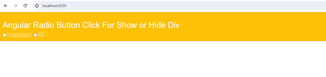
Output
Here, we run the command (ng serve) to start the angular app server. The result is shown on first time page load:
Then it performs hide and show HTML div on radio buttons click in angular application with the help of ngModel directive.